Sunday, November 17, 2013

Element of deisgn:Texture


 Visual:
Chair: Its bright and vivid
Lamp: The shade seems dark
Pillow: It is a printed pattern but seems like you could touch it.
Fabric: I think the printed texture makes you almost believe it is tactile.
Overall feel of room:Warm, but has a splash of excitement.


 Audible:
Chair:If you touch it is would make a scratchy rough sound.
Lamp: It would sound like a soft chime if you ran your fingers through it.
Vase: The red one would cause a squeak because it is smooth. The grey one would be rough and noisy.
Mirror: It would makes a clicking sound if you spun your hand around it.


Overall feel of room: Very neutral, and formal, but reds stand out.

Tactile:
Basket: It has a rough feel.
Lamp: sleek but still texture of scales.
Vase: It has a smooth bumpy texture
Mirror: Smooth but has creases and curves
Chicken: Fluffy and soft


Overall feel of room: Warm and fun


Example of a Display board for client:


Saturday, November 16, 2013

Elements of Line


Horizontal Lines

Placement of lines:
Couch, Table,Pillows, Wall, Pictures, Vase Design, room in general.

Effect of line:
Makes the room look wider rather than taller.

Feeling of line:
 Comforting, loose, relaxing


Vertical Lines


Placement of lines:
Pictures, Clock, Couch, Pillows, Items on Shelf, Iron Curtain, lamp, windows and column.
Effect of line:
Makes the room look taller rather than wider.

Feeling of line:
Stability, Sturdy, Formal, Dignity.


Diagonal Lines

Placement of lines:
Baskets, Lamps, Rug, Table, Vase, Wall art, Side tables,Books, Ceiling.
Effect of line:
Tipping or Slanting effect.

Feeling of line:
Activity, Movement, and excitement.


Curved Lines

Placement of lines:
Couch design, Ottoman, Lamp, Stairs, Wall Art, Rug, Pillow design, Vases, Sculptures, table.
Effect of line:
Bends and twists the area.

Feeling of line:
Natural, softens, comforting, and delicate feeling.

Friday, November 8, 2013

Wallpaper

 
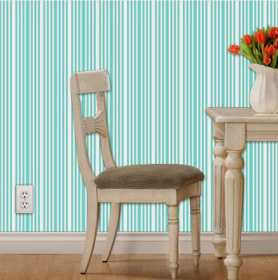
Vertical


Diagonal


Horizontal


Curvy


Extra


Color Schemes


Monochromatic


My monochromatic is a series of blues because I find blue to be very calming. I love all the different shades blue can turn into, it really does make a difference. Blue works well with the natural colors of the color spectrum. I think greys work wonders with a nice simple turquoise. Even browns would make the room feel calm when added to blues. That's why I chose blue to be my made color.


Triadic


I chose yellow, redish and blue-violet to be my triadic room because i feel they are very warm colors but they also pop out to make the room interesting but yet cozy. I really like the redish color because it stands out the most in the room. Grey was a perfect neutral color for this, its not too dark and not too plain so it really accents the colors well.


Split- Complimentary


I had a hard time choosing this color scheme because I wasn't sure I agreed that they went together. I do however like how the blue, yellow, and orange look in a shadowed room. I think grey is my ultimate favorite back splash for color. I like going with a cold color on the walls but make it warm and bright with my furniture and decor. when I look at this room I feel a sense of stability and warmth. So i think after designing the room, the colors do work well.

Analogous


I really like this color scheme. I went with greens and blues because I think they are more welcoming than reds and yellows all over. Blues and greens can be the only color in a room and it still looks great because they work well together. When I see this room I think of how relaxing and calming it is. It's like water, and that personally relaxes me. I liked how I took a vintage look to it but yet made it modern. This overall is my favorite room.